How to Show Slicer as Button in Power BI
Transforming a standard Power BI slicer into a set of clean, clickable buttons can instantly make your report feel less like a spreadsheet and more like an interactive app. This simple change improves the user experience and gives your dashboard a professional polish. This guide will walk you through exactly how to make this transformation, step by step.
What Exactly is a Power BI Slicer?
Before we turn them into buttons, let's quickly cover what slicers do. A slicer is one of the simplest yet most powerful types of visuals in Power BI. Its job is to provide an on-canvas filter that users can interact with directly.
Instead of digging into the filter pane, your end-users can click on options within the slicer to filter the data across other visuals on the report page. For example, you might use a slicer to let a user narrow down a sales report by:
- Year or Quarter
- Sales Region
- Product Category
- Team Member
When a user selects "North America," all the charts, tables, and cards on the page will instantly update to show data for only that region. It’s an essential tool for creating dynamic and user-friendly reports.
Free PDF · the crash course
AI Agents for Marketing Crash Course
Learn how to deploy AI marketing agents across your go-to-market — the best tools, prompts, and workflows to turn your data into autonomous execution without writing code.
Why Buttons Are a Smarter Choice for Slicers
By default, when you add a slicer in Power BI, it appears as a vertical list with checkboxes or a simple dropdown menu. While these work perfectly fine, they aren't always the best choice from a design or user experience perspective.
Here’s why formatting your slicers as buttons is often a better approach:
- Better User Interface (UI): Buttons are universally understood. People know to click them. This interaction feels more natural and intuitive than selecting from a long list, creating a smoother experience for your audience.
- Saves Space: A vertical list can consume a lot of valuable space on your report, especially if you have many options. By arranging your slicer options as horizontal buttons, you can fit them neatly into a header or sidebar, freeing up space for more important data visualizations.
- Modern Look and Feel: Button slicers give your report a clean, modern aesthetic. They make your Power BI dashboard look less like a static report and more like a purpose-built web application.
- Touch-Friendly: Buttons are much easier to tap accurately on a touchscreen device like a tablet or smartphone compared to small list items or dropdown menus.
How to Turn a Power BI Slicer into Buttons: A Step-by-Step Guide
Ready to make the change? The process is straightforward and relies on simply adjusting the visual’s format settings. Let’s walk through it with a practical example using a "Product Category" slicer.
Step 1: Add a Slicer Visual to Your Report
First, you need a slicer on your canvas. If you don't have one already, the process is simple.
- On the Power BI ribbon, make sure you're on the Home tab. In the main report view, look at the Visualizations pane on the right.
- Click the Slicer icon. It looks like a small funnel next to a table. A blank slicer visual will appear on your report canvas.
- With the slicer selected, go to the Fields pane (the list of your data tables and columns). Find the field you want to use for filtering - for our example, we'll use "Product Category" - and drag it into the 'Field' well in the Visualizations pane.
You should now see a slicer with a vertical list of your product categories.
Step 2: Change the Slicer Style to 'Tile'
This is the core step that changes the layout from a list to a button-like grid. Power BI calls this a 'Tile' style.
- Click on your slicer visual to select it.
- In the Visualizations pane, click on the paintbrush icon to open the Format your visual tab.
- Expand the Slicer settings section.
- You'll see an option called Style. Click the dropdown menu and change it from 'Vertical list' to 'Tile'.
Instantly, your slicer options will rearrange themselves into a horizontal or grid layout. They're already starting to look more like buttons!
Step 3: Make Them Truly Look Like Buttons
The 'Tile' style gives you the layout, but some extra formatting is needed to achieve a true button aesthetic. We'll adjust colors, borders, and shapes to make them look clickable and professional.
While still in the Format your visual tab:
Adjust the Shape:
- Navigate to the Shapes section.
- Under 'Shape', you can choose from 'Rectangle', 'Rounded rectangle', or 'Snipped tab'. A 'Rounded rectangle' with a corner radius of about 10-15px often provides a softer, more modern button look.
Adjust the Colors and Text:
- Expand the Values section. This is where you control the text appearance for each button.
- First, change the Font color to something that provides good contrast with your intended button color (e.g., white text on a dark button).
- Now, adjust the background color. Set the Background color to your desired default button color (e.g., a light gray or a muted brand color). This will be the state of an unselected button.
- Finally, you can add a subtle border. Change the Border color if needed and set the Border width to 1 pixel to make the buttons pop just a little bit.
You can also adjust the padding, font size, and text alignment in this section until you’re happy with the result.
Step 4: Configure Button Selection Behavior
A button should give clear visual feedback when it's selected. This helps users understand which filter is active.
- Find the Slicer settings section again.
- Under Selection, you can configure how the slicer behaves:
- Next, go to the Buttons format group. Inside, you'll find tabs for different states: 'Default', 'On hover', 'On press', and 'Selected'. We already set the default state when we configured the 'Values' background.
- Click on the Selected state tab. Change the Fill color to a standout color. This should be a much more prominent brand color to indicate that this is the active selection. For instance, if your default button is light gray, you might make the selected button dark blue. Make sure to adjust the Font color for the selected state as well to maintain readability (e.g., white text on the dark blue button).
- Optionally, go to the On hover state and set a slightly different fill color (e.g., a shade slightly darker than the default) to give users feedback when their mouse is over a button.
With these settings, you now have a fully functional and professional-looking set of slicer buttons that clearly display their state whether they are default, hovered, or selected.
Free PDF · the crash course
AI Agents for Marketing Crash Course
Learn how to deploy AI marketing agents across your go-to-market — the best tools, prompts, and workflows to turn your data into autonomous execution without writing code.
Bonus Tip: Creating a 'Reset Slicer' Button
Button slicers are great, but with multi-select enabled, users might want a quick way to clear all their selections. You can achieve this using a bookmark.
- Clear the Filter: On your report page, manually clear any selections in your button slicer so that no filters are applied.
- Create a Bookmark: Go to the View tab on the Power BI ribbon and open the Bookmarks pane. Click 'Add'. Rename the new bookmark something clear, like "Reset Category Slicer." Important: Click the three dots next to the bookmark and untick 'Data'. This ensures the bookmark only affects the visuals currently on the page and not other filtering aspects.
- Insert a Blank Button: Go to the Insert tab, click 'Buttons', and choose the 'Blank' button.
- Format and Link the Button: Place the button on your report (e.g., next to the slicer). In the formatting pane under 'Style', add text like "Clear Selection". Then, under 'Action', turn the action on, set the Type to 'Bookmark', and select your "Reset Category Slicer" bookmark from the dropdown.
Now, when a user clicks this new button, it will revert the slicer to the state you saved in the bookmark - with no categories selected, effectively clearing the filter.
Final Thoughts
Switching from a default list to Tiled button slicers is a small change that makes a huge impact on your Power BI reports. It elevates the visual design, improves interactivity, and provides a much more intuitive filtering experience for anyone viewing your dashboard.
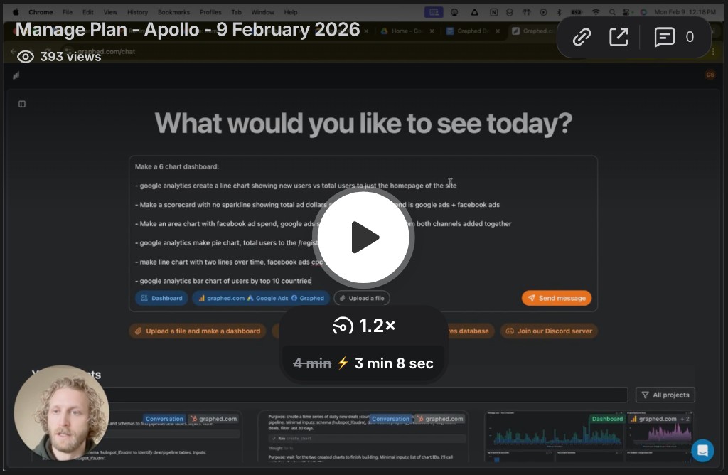
Ultimately, the goal of any report is to deliver clear insights quickly. We built Graphed around this same principle. While finely tuning visuals in Power BI can be powerful, we know how much time it can take. Our goal is to eliminate that manual-build process entirely by allowing you to create beautiful, interactive dashboards just by describing what you need in plain English. Instead of configuring slicer states and format settings, you can simply ask for the dashboard you need, and the AI builds it for you in real-time, letting you get directly to the insights you're looking for.
Related Articles
Facebook Ads for Window Cleaners: The Complete 2026 Strategy Guide
Learn how to use Facebook ads to generate consistent leads for your window cleaning business in 2026. This complete guide covers targeting, ad types, budgeting, and optimization strategies.
Facebook Ads For Pet Stores: The Complete 2026 Strategy Guide
Learn how to run profitable Facebook ads for pet stores in 2026. Discover hyper-local targeting strategies, audience insights, and creative frameworks that drive results.
Facebook Ads for Medical Spas: The Complete 2026 Strategy Guide
Discover the proven Facebook advertising strategies that top medical spas use to generate qualified leads and bookings in 2026. This comprehensive guide covers ad formats targeting budget and full-funnel campaign setup.