How to Publish Mobile Layout in Power BI
Your team isn't chained to their desks, and your data shouldn't be either. You can build the most insightful Power BI report in the world, but if stakeholders can't access it easily on the go, its impact is instantly limited. This article will walk you through exactly how to create, configure, and publish a mobile-friendly layout in Power BI, ensuring your reports are as useful on a phone as they are on a monitor.
Why a Dedicated Mobile Layout Matters
In a world where business happens in airport lounges, client offices, and during the morning commute, mobile access to data is non-negotiable. While the Power BI mobile app can display your standard desktop report, the experience is often less than ideal. Text becomes microscopic, complex visuals get squished, and users are stuck pinching and zooming just to make sense of anything.
By creating a dedicated mobile layout, you are taking control of the user experience. You decide how visuals are presented on a smaller, vertical screen, ensuring clarity and usability. A well-designed mobile layout empowers colleagues and clients to:
- Get Answers Faster: They can check key performance indicators (KPIs) in seconds without needing to boot up a laptop.
- Make Better On-the-Go Decisions: A sales rep can pull up client performance data right before a meeting, or a marketing manager can check campaign results while grabbing coffee.
- Increase Report Adoption: When reports are easy to use, people use them more often. A simple, accessible mobile view removes a huge friction point for busy team members.
Getting Started: What You'll Need
Before you dive in, make sure you have a few things ready. The good news is, you likely already have everything you need.
- A Completed Power BI Report: You'll start with an existing report you’ve already created in Power BI Desktop. The mobile layout is an alternate view of your desktop design, not a separate report.
- Power BI Desktop: This is where you will build and configure the mobile layout. It must be done on the desktop application.
- The Power BI Mobile App: Make sure you (and your users) have the app installed on your smartphone to view the final product. It's available for free on both iOS and Android.
Free PDF · the crash course
AI Agents for Marketing Crash Course
Learn how to deploy AI marketing agents across your go-to-market — the best tools, prompts, and workflows to turn your data into autonomous execution without writing code.
Step-by-Step Guide: Creating the Mobile Layout
This is where the magic happens. The process is surprisingly straightforward and uses a simple drag-and-drop interface. Let's take your beautiful desktop report and make it mobile-ready.
Step 1: Open Your Report and Go to Mobile Layout View
First, open the .pbix file of the report you want to optimize in Power BI Desktop.
Once it's loaded, navigate to the View tab in the ribbon at the top. On the far left of the View ribbon, you will see a button labeled Mobile layout. Click it.
Step 2: Meet the Mobile Canvas
You'll now see a screen that looks like a simplified phone. This is your mobile canvas. It's a long, scrolling canvas that represents how the report will appear on a mobile device in portrait mode.
To the right of the canvas, you'll see a pane titled Visualizations. This pane contains every single visual that exists in your desktop report view. They are available for you to place onto the mobile canvas. Note: Any visuals you leave in this pane and don't drag onto the canvas will not appear in the mobile view.
This is an important feature, not a bug! It lets you be selective and show only the most critical information on mobile, creating a cleaner, more focused experience.
Step 3: Add and Arrange Your Visuals
This part is just like arranging furniture in a room. Click on a visual from the Visualizations pane on the right, drag it over to the canvas on the left, and drop it where you'd like it to appear.
You can:
- Position: Drag a visual up or down on the canvas to change its order. Think about what your users need to see first. Usually, you'll want to place your most important KPIs, like total revenue or conversion rate, at the very top.
- Resize: Hover over the edges of a visual to find the resize handles. You can click and drag to make it wider, narrower, taller, or shorter. The visuals will automatically snap to a grid, which helps keep your layout clean and aligned without any extra effort.
- Rearrange: Don't like where you put something? Just drag it somewhere else on the canvas. To reorder visuals that are already on the canvas, simply drag one on top of the other to swap their positions seamlessly.
Step 4: Optimize Visuals for the Small Screen
Simply placing your visuals isn't enough. You need to make sure they are actually readable and usable on a small screen. This may require some adjustments.
To edit a visual's properties (like font sizes or colors), you must switch back to the Desktop layout.
- Click the Desktop layout button next to the Mobile layout button in the View tab.
- Select the visual you want to modify (e.g., a clustered bar chart).
- Go to the Format your visual pane (the paintbrush icon).
- Adjust the settings. Good candidates for on-screen optimization include:
Heads Up: Any formatting changes you make here will affect both the desktop and mobile views. There isn't a way to have different font sizes for each layout. Find a happy medium that is legible on mobile without being comically oversized on desktop.
Step 5: Remove Visuals You Don't Need
Remember, less is more on mobile. Be ruthless. Does a team member on the go really need to see that detailed data table? Probably not. Remove any visual from the mobile canvas by hovering over it and clicking the small grey 'X' in the top-right corner. This does not delete the visual from your report, it just removes it from the mobile view, decluttering the experience.
Publishing and Viewing Your Mobile Report
Once your mobile canvas is perfectly arranged, it's time to publish it so people can actually see it.
- First, save your report in Power BI Desktop to lock in the Mobile layout changes you've made.
- Next, navigate to the Home tab in the ribbon and click the Publish button.
- A dialog box will appear asking you to select a destination workspace. Choose the appropriate one (e.g., "My workspace" or a shared team workspace) and click Select.
- Once publishing is complete, it's time to test your work! Open the Power BI app on your smartphone.
- Navigate to the workspace where you published the report and open your report. The app will automatically detect that a mobile layout exists and display it by default.
Tap your screen, test your slicers, and scroll through the layout to make sure everything looks and behaves as you expect. This final check is crucial for catching any readability issues before you share it with your team.
Free PDF · the crash course
AI Agents for Marketing Crash Course
Learn how to deploy AI marketing agents across your go-to-market — the best tools, prompts, and workflows to turn your data into autonomous execution without writing code.
Best Practices & Common Mistakes to Avoid
Configuring the layout is easy, but great design requires a bit more thought. Keep these principles in mind:
Do's and Best Practices
- Tell a Scrolling Story: Arrange your visuals logically from top to bottom. Start with high-level summaries (KPI Cards), then provide more detailed breakdowns (Bar/Line Charts) as the user scrolls down, and end with the most granular information if needed.
- Prioritize clarity over quantity: If a visual is too complex or hard to read, don't include it. A simpler, clearer mobile report that answers 80% of common questions is far more valuable than a cluttered one that tries to answer everything and instead answers nothing well.
- Use Bookmarks Strategically: You can create bookmarks that apply to specific mobile layouts. This is a power feature that lets you create different "views" within a single mobile report, further focusing the user on a specific task or data story.
Don'ts and Common Mistakes
- Forgetting to Design It: The biggest mistake is not creating a mobile layout at all. The default view on the mobile app is just a shrunken version of your desktop report, and that is a frustrating user experience.
- Trying to Cram Everything In: Do not replicate your desktop report 1:1. The point of the mobile layout is to distill your report down to its essential, on-the-go insights. Be selective.
- Ignoring Font Sizes: Don't forget that readable text is key. Forgetting to bump up your font sizes is a common oversight that can make your otherwise beautiful report nearly useless on a smaller screen.
- Skipping the Device Test: Never publish and share without first looking at the report on your own phone. How it looks on your desktop canvas and how it feels to interact with on a real device can be two very different things.
Final Thoughts
Creating and publishing a mobile layout in Power BI is a critical step in a data-driven culture. It's a straightforward process that transforms your reports from static desktop displays into interactive, accessible tools that empower decision-making anywhere, anytime. By thinking critically about what data matters most on the go, you can significantly increase the value and adoption of your work.
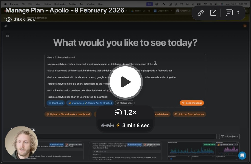
The entire challenge of building separate report layouts highlights a broader struggle - traditional BI tools are often complex and time-consuming. We built Graphed to eliminate that friction entirely. Rather than wrestling with configurations, you can just describe the dashboard you need in plain English. For example, say, "Show me my top 5 marketing campaigns by revenue over the last quarter" and have an interactive, instantly mobile-friendly dashboard built for you in seconds. With us, you get straight to the insights without the busywork, because all of your analysis with Graphed is accessible and formatted for any device by default.
Related Articles
Facebook Ads for Carpet Cleaners: The Complete 2026 Strategy Guide
Learn how to run Facebook ads for carpet cleaning businesses in 2026. Get proven strategies for targeting, creative formats, retargeting, and budget that actually convert.
Facebook Ads For Personal Trainers: The Complete 2026 Strategy Guide
Learn how to effectively use Facebook ads for personal trainers in 2026. This comprehensive guide covers targeting strategies, ad creative, budgeting, and optimization techniques to help you grow your training business.
Facebook Ads for HVAC Companies: The Complete 2026 Strategy Guide
Learn how to run high-converting Facebook ads for HVAC companies in 2026. This guide covers targeting, creative strategies, and proven campaigns that drive real leads.