

How to Learn Looker
Learning a powerful business intelligence tool like Looker can seem daunting, but it's a manageable skill that unlocks a massive amount of insight from your company's data. Breaking the process down into logical steps is the key to building confidence and proficiency. This guide will provide a clear roadmap for learning Looker, taking you from understanding its core concepts to creating your first shareable dashboard.
What Makes Looker Different?
Before jumping into the "how," it's helpful to understand what Looker is and how it stands apart from other BI tools like Tableau or Power BI. While they all create charts and dashboards, Looker's foundation is built on a centralized data modeling layer called LookML.
Think of LookML as a recipe book for your data. Data analysts and developers use it to define all of your business logic in one place. They create pre-defined metrics (like "Revenue," "Active Users," or "Conversion Rate") and establish relationships between different data tables. This has two huge benefits:
- Consistency: Everyone in the company uses the same definitions for key metrics. You won't have the marketing team and the sales team reporting different numbers for "new customers" because they calculated it differently.
- Simplicity for Users: As a business user, you don't have to write complex SQL code or drag-and-drop raw database fields. You get to play in a curated sandbox where the metrics are already defined, clearly named, and ready for you to explore.
Your job as a Looker user isn't to build everything from scratch, but to use these pre-built components to ask questions and find answers.
Getting Started: Your Learning Plan
The best way to learn Looker is by doing. Approach it in stages, moving from consuming information to actively creating it. This step-by-step path is designed to build your skills progressively without overwhelming you.
Free PDF · the crash course
AI Agents for Marketing Crash Course
Learn how to deploy AI marketing agents across your go-to-market — the best tools, prompts, and workflows to turn your data into autonomous execution without writing code.
Step 1: Explore Existing Dashboards
The absolute first step is to simply look around. Your organization likely already has dozens of pre-built dashboards for different departments. Don't worry about how they were made yet. Just use them as a consumer.
- Find the dashboards relevant to you. Whether it's the weekly marketing performance review, the quarterly sales leaderboard, or a product usage report, start with what matters to your role.
- Interact with the filters. Most dashboards have filters at the top (e.g., date range, region, product category). Play with them to see how the data changes. This is the primary way most users interact with existing reports.
- Hover over charts. Get familiar with the tooltips that appear when you hover over data points in a chart. This often reveals more detailed numbers.
- Ask questions. As you look at the dashboards, ask yourself: What story is this data telling? Does anything look surprising? Are we trending up or down?
This initial phase gets you comfortable with the Looker interface and the key performance indicators (KPIs) your company tracks without the pressure of having to build anything.
Step 2: Understand the Core Components: Explores, Looks, and Dashboards
Once you're familiar with the lay of the land, it's time to learn the three building blocks of Looker content.
- Explores: An Explore is a starting point for asking your own questions. It's a view of your data that has been curated by your data team. For example, you might have Explores called "Website Traffic," "Sales Orders," or "Campaign Performance," each containing all the relevant fields for analyzing that topic. This is where you'll spend most of your time when creating new reports.
- Looks: A Look is a single, saved data visualization or table that you create from an Explore. Think of it as a single chart or a single report. For example, a line chart showing website sessions over the last 30 days is a Look.
- Dashboards: A Dashboard is a collection of Looks organized on a single page. It gives you a high-level view of multiple related metrics at a glance. Most of the reports you reviewed in Step 1 were dashboards.
So, the workflow is this: you go to an Explore to ask a question, you save the answer as a Look, and you organize one or more Looks onto a Dashboard to tell a complete story.
Step 3: Dive into an Explore and Build Your First Look
This is where the real fun begins. Go to the "Explore" section in Looker and pick one that sounds familiar, like "Website Traffic" from your Google Analytics data.
The Explore interface is generally split into two parts:
- The Field Picker (Left Panel): This is your menu of available data. It's divided into Dimensions (blue icons) and Measures (orange icons).
- The Results Area (Right Panel): This is where your data table and visualization will appear. At the top, you'll see sections for filters and the data itself.
Let's walk through an example. Goal: See the number of users by traffic source over the past 7 days.
- Select your fields: From the field picker, find and click on the "Traffic Source" dimension and the "Total Users" measure.
- Run the query: Hit the "Run" button. You'll see a data table appear with a list of traffic sources and the total user count for each.
- Add a filter: Find the "Date" dimension. Instead of clicking it, hover over it and click the "Filter" icon. Set the filter to "is in the past 7 days" and hit "Run" again. Now your data is limited to the last week.
- Choose a visualization: Above the results table, there's a "Visualization" section. Click on the different chart types. A bar chart or a pie chart would work well for this data. Looker will automatically render your data as a chart.
- Save your work: Once you're happy, click the gear icon in the top right and select "Save as a Look." Give it a descriptive name like "Users by Source - Last 7 Days" and save it to your personal folder.
Congratulations! You've just gone through the entire basic workflow of creating a report in Looker.
Step 4: Create Your First Dashboard
A single report is great, but a dashboard provides context. Now, let's put the Look you just created onto a new dashboard.
- Navigate to your personal folder where you saved your Look.
- Find the Look, click the three-dot menu next to it, and select "Add to Dashboard."
- You'll be prompted to add it to an existing dashboard or create a new one. Choose "New Dashboard," give it a title like "My Weekly Website Overview," and create it.
- You'll land on a blank dashboard in "edit mode," with your Look appearing as a "tile." You can drag and resize this tile however you like.
- Now, go create another Look! For example, repeat Step 3 but this time create a line chart showing "Total Users by Date" for the past 7 days. Save it, then add it to your new "My Weekly Website Overview" dashboard.
You can now see how quickly you can assemble a custom report that monitors your key metrics. In edit mode, you can also add text tiles to explain what the charts mean or filters that apply to the whole dashboard at once.
Essential Skills to Practice
As you get more comfortable, focus on mastering these key features that will elevate your analysis from basic to insightful.
Effective Filtering
Don't just stick with simple date filters. Click the "add filter" button and see what's possible. You can create complex logic with AND/OR statements, use conditions like "contains," "starts with," or create "matches (advanced)" filters for more complex patterns. For example, you could filter for all campaign names that contain "Spring_Sale" and come from either "Facebook" or "Google."
Pivoting Data
Pivoting is your best friend for comparing trends across categories. Let’s say you have a table showing Revenue by Week by Product Category. It will likely show a long list. By clicking the "Pivot" icon next to Product Category, Looker will transform your table. Now, the weeks will still be rows, but each product category will become its own column. This makes it incredibly easy to see if, for example, your "Electronics" and "Apparel" categories are trending up or down over the same time period.
Free PDF · the crash course
AI Agents for Marketing Crash Course
Learn how to deploy AI marketing agents across your go-to-market — the best tools, prompts, and workflows to turn your data into autonomous execution without writing code.
Table Calculations
Sometimes you need to create a one-off metric that wasn't defined in the LookML model. Table Calculations let you do this right in the Explore interface without needing a developer.
A classic example is calculating a percent-of-total. Let's say you have a table showing user counts by country. To see what percentage of users comes from each country:
- In the data table, click the gear icon on the "Users" column and choose "Percent of Total." Looker adds a new column instantly.
- For more complex math, click "Add new calculation." You can then write Excel-like formulas. To calculate a simple conversion rate between two columns, like
sessionsandorders, your formula would be as simple as:`${orders}/${sessions}`
Note: Table Calculations only operate on the data currently in your results table. If you change a filter, the calculation will re-run on the new data set.
Scheduling & Sharing
Great analysis is useless if it isn't shared. Any Look or Dashboard can be scheduled for delivery. You can set it up to email a PDF or a data table to yourself and your team every Monday morning, or send an alert if a key metric goes above or below a certain threshold. Get familiar with the "Schedule delivery" option in the settings menu.
Final Thoughts
Learning Looker is a journey that starts with being a curious user of existing reports and gradually transitions into being a confident creator of your own analysis. By focusing on the core workflow of exploring data, saving insights as Looks, and combining them into dashboards, you can build a powerful skillset for data-driven decision-making.
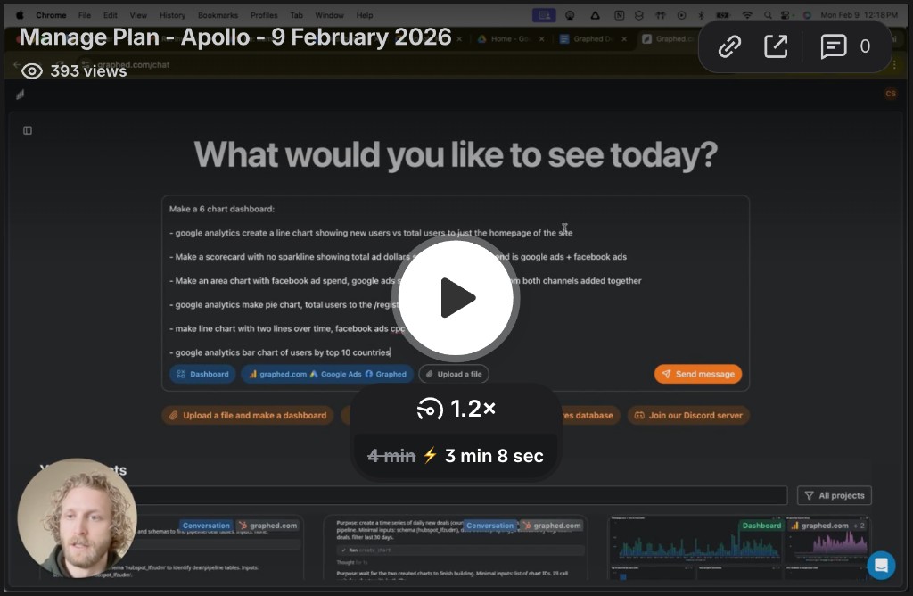
While mastering traditional BI tools is a rewarding process, sometimes you need immediate answers from your data without a complex setup. That's why we created Graphed. We connect to your marketing and sales platforms in a few clicks, allowing you to use simple, natural language to instantly build the dashboards you need. Instead of learning a new interface or waiting for developers, you can just ask questions like "Show me a comparison of Facebook Ads spend versus Shopify revenue by campaign last month" and get a real-time, shareable dashboard in seconds.
Related Articles
Facebook Ads for Pool Cleaners: The Complete 2026 Strategy Guide
Learn how to use Facebook Ads for pool cleaning businesses in 2026. Complete strategy guide covering targeting, ad creative, budgeting, and lead generation.
Facebook Ads for Insurance Agents: The Complete 2026 Strategy Guide
Learn how to use Facebook ads to generate quality leads for your insurance agency in 2026. This comprehensive guide covers targeting, creative strategies, and compliance rules.
Facebook Ads for Real Estate Agents: The Complete 2026 Strategy Guide
Master Facebook ads for real estate agents in 2026. Learn targeting, ad formats, budgets, and creative best practices to generate more leads.