How to Fit Tableau Dashboard to Screen
Building a beautiful, insightful dashboard in Tableau is one thing, but making sure it looks right on everyone's screen is another challenge entirely. You might design the perfect layout on your monitor, only to find it overflowing with scrollbars or awkwardly scrunched on a colleague's laptop. This quick guide will walk you through the dashboard sizing options in Tableau so you can fit everything to the screen perfectly every time.
Understanding Tableau's Dashboard Sizing Options
Tableau provides three core sizing options that dictate how your dashboard's dimensions behave. These are found in the 'Dashboard' pane on the left side of your screen, under the 'Size' dropdown. Understanding the purpose of each is the first step to taming your layout.
1. Fixed Size
As the name suggests, a Fixed size dashboard has static height and width dimensions that you define in pixels. The canvas will be exactly the size you specify, regardless of the screen size it's viewed on.
- When to use it: This is the safest and most common option. Use it when you need complete control over the layout and know the exact dimensions of where it will be displayed, such as embedding it on a specific webpage or for internal reports viewed on standard-sized company monitors.
- Pros: Predictable and reliable. What you design is what your end-users see. You won't have elements unexpectedly shifting, resizing, or overlapping. It gives you precise control over positioning and whitespace.
- Cons: Lacks flexibility. If a user’s screen is smaller than the fixed dimensions, they will have to scroll both horizontally and vertically to see the entire dashboard. If their screen is larger, the dashboard will appear with extra empty space around it.
2. Automatic
The Automatic option attempts to make your dashboard responsive by automatically resizing its contents to fill the entire screen of the viewer’s device. It's Tableau's built-in attempt at a "one size fits all" solution.
- When to use it: Use Automatic when you need your dashboard to be accessible across a wide variety of devices with different screen resolutions, from small laptops to large conference room displays. This can be great if you don't care about a "pixel-perfect" layout and prioritize filling the available space.
- Pros: Highly responsive. It eliminates scrollbars and empty margins by dynamically adjusting to the available window size on the viewer's end.
- Cons: Highly unpredictable. This option can lead to distorted visualizations, stretched images, and unreadable text. Dashboards with many charts and text boxes often look cluttered or awkward because Tableau resizes every component proportionally, which doesn't always work as intended.
Free PDF · the crash course
AI Agents for Marketing Crash Course
Learn how to deploy AI marketing agents across your go-to-market — the best tools, prompts, and workflows to turn your data into autonomous execution without writing code.
3. Range
Range is a hybrid approach that gives you a middle ground between the rigidity of Fixed and the potential chaos of Automatic. With this option, you define a minimum and maximum size. The dashboard will scale itself to fit the viewer's screen, but only within the bounds you set.
- When to use it: Range is excellent when you want some responsiveness but still need to maintain control over the basic proportions and readability of a dashboard. For example, you can design it for a standard laptop screen but allow it to gracefully scale up for larger monitors without warping.
- Pros: The best of both worlds. It provides flexibility while preventing the extreme distortion that can occur with the Automatic setting. It allows you to design for a target size while accommodating reasonable variations.
- Cons: Requires more thoughtful planning. You need to carefully test how your dashboard looks at both its minimum and maximum defined sizes to ensure the layout remains functional.
How to Set Your Dashboard's Size: A Step-by-Step Guide
Changing the sizing is straightforward. Follow these steps to find and adjust the settings.
- Navigate to your dashboard view in Tableau Desktop.
- On the left-hand side, make sure the 'Dashboard' tab is selected (next to the 'Layout' tab).
- At the top of this pane, you'll see a section called 'Size'. It usually defaults to a 'Fixed size' computer monitor template, like 'Desktop Browser (1000 x 800)'.
- Click the dropdown menu. Here you can choose between 'Fixed size', 'Automatic', and 'Range'.
- If you select 'Fixed size', you can use the presets (e.g., Laptop, Desktop, Story) or enter custom width and height values in pixels.
- If you select 'Automatic', the height and width options disappear, as the dashboard will now adapt to the viewer's screen.
- If you select 'Range', you will be prompted to set a minimum size (e.g., 1000px width x 800px height) and a maximum size (e.g., 1600px width x 1000px height).
Once you’ve made your choice, you can start building or modifying your dashboard to best suit the sizing behavior you’ve selected.
Best Practices for Each Sizing Option
Just setting the size isn't always enough. You need to design your dashboard with that setting in mind. Here’s how to make each option work for you.
Optimizing a 'Fixed Size' Dashboard
Since this gives you the most control, your main focus should be choosing the right dimensions and organizing your content logically.
- Pick a Common Resolution: Before you build, find out the most common screen resolution of your primary audience. Many business users still use standard laptops with resolutions like 1366 x 768 or 1920 x 1080. Designing for a slightly smaller common dimension is a safe bet.
- Use Layout Containers: Even with a fixed size, use Horizontal and Vertical layout containers to group related worksheets and objects. This keeps your dashboard organized and makes it much easier to adjust later if needed.
- Master Padding and Borders: Use white space effectively. Adding 'Outer Padding' and 'Inner Padding' to your objects helps create a clean, professional look and prevents elements from feeling cramped.
Taming an 'Automatic' Dashboard
Making an Automatic dashboard look great requires a minimalist approach and a deep reliance on containers.
- Simplify, Simplify, Simplify: Automatic sizing works best on simple dashboards. The fewer worksheets, text boxes, and filters you have, the less chance there is for distortion. If you have a complex dashboard, Automatic is likely the wrong choice.
- Embrace Layout Containers: Containers are everything for Automatic sizing. By placing charts into Vertical and Horizontal containers, you control how Tableau groups and resizes them. It forces relational spacing rules instead of letting Tableau make its own decisions. For instance, putting two charts in a horizontal container ensures they will always appear side-by-side, no matter the screen size.
- Pay Attention to Item Fitting: For each worksheet within the dashboard, you have fit options ('Standard', 'Fit Width', 'Fit Height', or 'Entire View').
Fit Widthis often a good choice, as it prevents horizontal scrollbars while letting the item’s height adjust. UseEntire Viewwith caution, as it will stretch your visualization both horizontally and vertically, often leading to visual distortion.
Designing Flexibly with a 'Range' Dashboard
Range gives you controlled flexibility. The goal here is to find a sweet spot that covers most common use cases.
- Test the Extremes: Set your min and max sizes. Then, drag the corners of the dashboard canvas in Tableau Desktop to see how it looks at its smallest and largest dimensions. Do legends or filters get cut off at the minimum? Does it look too spread out at the maximum?
- Set a Smart Minimum: Choose a minimum width that corresponds to the smallest reasonable screen you expect your audience to use, for example, a standard small laptop size (e.g., 1280px wide). This will prevent the dashboard from becoming unusable on small screens.
- Use a Sensible Maximum: Your maximum size should prevent the dashboard from looking sparse and empty on very large monitors. A max width of around 1920px is often sufficient for most business cases.
Advanced Tips and Common Pitfalls
Beyond the basics, here are a few more tips to help you create perfectly sized dashboards.
Use the Device Previewer
Tableau has a fantastic built-in tool that lets you see how your dashboard will look on various devices. At the top of your dashboard in Tableau Desktop, click the 'Device Preview' button. This will show you exactly how your dashboard layout will render on common devices like a generic phone, tablet, or desktop screen. This is essential for testing Automatic and Range sized dashboards.
Tiled vs. Floating Layouts
When you drag objects onto a dashboard, you can choose to make them 'Tiled' (they snap into a grid system) or 'Floating' (you can place them anywhere with pixel accuracy). For responsive design (Automatic or Range), Tiled is almost always the better choice. Floating elements have fixed positions and sizes, and they will not resize with the rest of the dashboard, often leading to them covering up other important information on different screen sizes.
Free PDF · the crash course
AI Agents for Marketing Crash Course
Learn how to deploy AI marketing agents across your go-to-market — the best tools, prompts, and workflows to turn your data into autonomous execution without writing code.
A Note on Text and Images
Be mindful that text objects and images scale with your dashboard when using Automatic sizing. Very long text boxes can become hard to read on smaller screens, and images may become severely pixelated or squashed. Keep your text concise and use high-resolution images if you must include them in an 'Automatic' dashboard.
Final Thoughts
Figuring out how to fit a Tableau dashboard to the screen is all about choosing the right sizing strategy - Fixed for control, Automatic for responsiveness, and Range for a flexible compromise. By combining a smart sizing choice with organized layout containers, you can ensure a consistent and professional viewing experience for your entire audience.
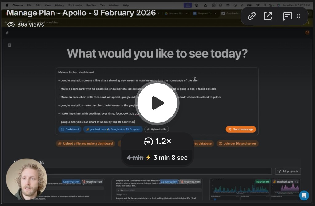
Of course, spending hours perfecting layouts and resizing settings in a BI tool is just one of the many manual tasks involved in reporting. We created Graphed because we wanted to eliminate the friction between data and decisions. Instead of fighting with complex dashboard builders, you can simply ask for what you want in plain English - like "create a sales performance dashboard showing deal velocity by rep this quarter" - and get a live, shareable dashboard built instantly, saving you time to focus on the insights, not the setup.
Related Articles
Facebook Ads for Pest Control: The Complete 2026 Strategy Guide
Learn how to run effective Facebook ads for pest control companies in 2026. This comprehensive guide covers campaign setup, targeting strategies, cost benchmarks, and best practices for generating quality leads.
Facebook Ads for Carpet Cleaners: The Complete 2026 Strategy Guide
Learn how to run Facebook ads for carpet cleaning businesses in 2026. Get proven strategies for targeting, creative formats, retargeting, and budget that actually convert.
Facebook Ads For Personal Trainers: The Complete 2026 Strategy Guide
Learn how to effectively use Facebook ads for personal trainers in 2026. This comprehensive guide covers targeting strategies, ad creative, budgeting, and optimization techniques to help you grow your training business.