How to Create a Mobile App Dashboard in Power BI
Building a great report in Power BI is a fantastic first step, but making it useful on a phone is where the real value kicks in. A standard desktop dashboard, when shrunk down to a mobile screen, often becomes an unreadable mess of tiny charts and impossible-to-tap filters. This guide will walk you through the process of creating a clean, professional, and genuinely useful mobile dashboard in Power BI, turning your detailed reports into quick, on-the-go insights.
Before You Build: Why a Mobile Layout is an Essential Step
Too often, the mobile layout is treated as an afterthought - something you quickly throw together at the end. But in a world where key decisions are made away from the desk, a well-designed mobile view is crucial. Your sales team can check daily numbers from the field, and your CEO can get a quick snapshot of business health between meetings. A mobile-optimized dashboard isn't just a shrunken report, it’s a specific tool designed for quick looks and fast answers. It forces you to prioritize what truly matters, displaying only the most critical information without the clutter.
Step 1: Build Your Starting Report in Power BI Desktop
You can’t create a mobile layout without a desktop report to pull from first. The magic happens in the design phase - a clean and simple desktop report is exponentially easier to adapt for mobile. A dashboard packed with dozens of visuals will be a nightmare to rearrange on a small screen.
Keep Your Visuals and Data Simple
Before you even think about the mobile layout, focus on simplicity in your main report. The goal isn't to cram every possible piece of data onto one page. Stick to the essential metrics that tell a clear story. Ask yourself, "If I could only see three to five numbers on my phone, what would they be?" This mindset will help you build a solid foundation.
Free PDF · the crash course
AI Agents for Marketing Crash Course
Learn how to deploy AI marketing agents across your go-to-market — the best tools, prompts, and workflows to turn your data into autonomous execution without writing code.
Choose Mobile-Friendly Visuals
Not all Power BI visuals are created equal, especially when it comes to mobile viewing. Some work beautifully on a small, vertical screen, while others become useless. Here are some good choices:
- Card Visuals: The absolute hero of mobile dashboards. They are perfect for displaying single, important key performance indicators (KPIs) like Total Revenue, New Customers, or Website Sessions.
- Donut and Pie Charts: These work well for showing parts of a whole, like sales by region or traffic by source, as long as you don't have too many categories.
- Simple Bar and Column Charts: Vertical and horizontal bar charts are easy to read and scroll through on a phone. The mobile app handles these particularly well.
- Gauge Visuals: Useful for showing progress towards a target, like tracking monthly sales against a quota.
And here are some visuals to use with caution, or avoid entirely, on mobile:
- Matrixes and detailed Tables: Squinting at tiny rows and columns of data on a phone is no fun. Unless it's just a few rows, leave these for the desktop view.
- Maps (Filled Maps, Shape Maps): These require zooming and panning, which can be clumsy in the Power BI mobile app. Simple charts are almost always a better option for displaying geographical data.
- Combo Charts with Many Lines: Too many lines or axes become a tangled web on a small screen.
A Practical Example: A Simple Marketing Dashboard
To make this tangible, let’s imagine we're building a dashboard to track weekly marketing performance. In Power BI Desktop, we might create a report with the following visuals:
- A Card showing "Total Website Clicks."
- A Card showing "Cost Per Click (CPC)."
- A Card showing "Total Conversions."
- A Column Chart showing "Clicks by Campaign Name."
- A Donut Chart showing "Traffic by Marketing Channel (e.g., Google Ads, Facebook Ads, Organic)."
This mix gives us our key KPIs at a glance and some simple supporting charts. It's clean, focused, and ready to be adapted for mobile.
Step 2: Start Designing in the Mobile Layout View
With your desktop report ready, it’s time to design the mobile experience. This is where you transform your collection of visuals into a purposeful, easy-to-read vertical layout.
Switching to the Mobile Layout Canvas
In Power BI Desktop, navigate to the View tab in the top ribbon and click on Mobile Layout. Your screen will change to show a long, skinny phone-shaped canvas. On the right-hand side, you’ll see the "Visualizations" pane, which now lists all the visuals from your desktop report page. Anything you built in the previous step will be available here to add onto your mobile canvas in the order you want to arrange them.
Arranging Your Visuals for On-the-Go Viewing
Think of your mobile dashboard as a single, scrollable feed. The process is a simple drag-and-drop:
- Start with your most important numbers first. Click and drag your main KPI cards (like "Total Clicks" and "Total Conversions") from the Visualizations pane onto the top of the mobile canvas. Viewers should see the most critical info without having to scroll.
- Stack and resize. Drag visuals around on the grid. They will "snap" into place, which helps maintain alignment. You can easily drag the corners of a visual to resize it. It’s a common best practice to stack KPI cards at the top, either one per row or two side-by-side if they fit comfortably.
- Add your charts below the KPIs. Once your key numbers are in place, drag your supporting charts - like the "Clicks by Campaign Name" bar chart - onto the canvas below the cards. Notice how a vertical bar or column chart naturally fits this format, allowing users to scroll down to see more categories.
- Be selective about which visuals to add. Not every visual from your desktop page needs to appear on mobile. This is your chance to curate the experience. If a slicer or a detailed visual feels too cluttered for a mobile screen, simply leave it out of the mobile layout. It will still be visible on the desktop version but hidden on mobile, which is often for the best in a lot of scenarios.
Step 3: Optimize for the Best Mobile Experience
Having your visuals on the canvas is a great start, but a few small tweaks can drastically improve the usability of your dashboard.
Size and Formatting Matter
Once you’ve arranged everything, you’ll likely notice some formatting looks a bit off. Maybe the font size that was perfect on the desktop now looks huge on mobile cards. You can adjust this:
Click on a visual on the mobile canvas, then go to the Format visual pane (the paintbrush icon). Make any changes here, like reducing the font size for a Card’s callout value or data label. It’s important to know that formatting changes made in the mobile layout often affect the desktop layout too, so go back and forth between the two views to make sure you get a visual style that works for each one and looks its best in both report layouts.
Keep Filters Simple and Tappable
Filters and slicers can be very tricky on a small touch screen. If you must include slicers, make sure they are big enough to be easily tapped with a thumb.
- Choose Dropdown slicers over List slicers. They save a huge amount of screen space.
- Avoid complex, "stringy" slicers where users have to scroll endlessly. Often, it's better just to omit slicers from your report's mobile layout entirely to cut down on unnecessary clutter.
Check Readability From Top to Bottom
Once your visuals have been laid out, step back and look at the entire layout and your overall flow. Does it tell a logical story from top to bottom? A common pattern is:
- High-level KPIs at the top (the "what").
- Breakdown charts in the middle (the "where" and "why").
This structure allows a user to get the big picture in seconds, and then scroll down if they want to get to the details.
Step 4: Publish Your Report and Go Live
You’ve designed and optimized the layout, the final step is to publish it and check it out on an actual phone. After all, the canvas is an emulator. You haven't truly verified it will look good unless you test and use the report on your smartphone.
Free PDF · the crash course
AI Agents for Marketing Crash Course
Learn how to deploy AI marketing agents across your go-to-market — the best tools, prompts, and workflows to turn your data into autonomous execution without writing code.
Publish to the Power BI Service
In Power BI Desktop, go to the Home tab and click the Publish button. A dialog box will appear asking you to select a destination workspace. Choose your "My Workspace" or a shared team workspace and hit "Select." Power BI will upload the report (including both the desktop and mobile layouts) to the secure Power BI online service.
Viewing in the Power BI Mobile App
Now, grab your smartphone!
- Download the Power BI mobile app from the Apple App Store or Google Play Store if you haven’t already.
- Open the app and sign in with your Power BI account credentials.
- Navigate to Workspace in the bottom menu and find the report you want to view, locate it, and tap to view away.
When you open the report on your phone, Power BI automatically detects you’re on a mobile device and displays the optimized mobile layout you just created. It really does work that easily every time! Scroll through the report, and make sure everything is readable. Don’t hesitate to make some revisions by returning to step five and taking time to fine-tune your work, if necessary.
Final Thoughts
Building a mobile-friendly dashboard in Power BI is a design process that transforms your data from a static desktop report into a dynamic tool anyone on your team can use from anywhere. By starting with simple visuals, thoughtfully arranging them in the Mobile Layout view, and optimizing for at-a-glance readability, you can make your data more accessible and far more impactful for everyone in your organization.
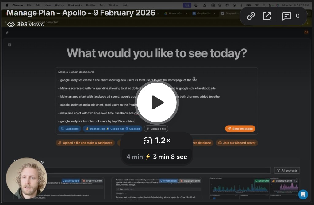
Of course, even with Power BI's tools, designing reports and connecting data from all your different marketing and sales platforms - like Google Analytics, Shopify, Salesforce, and Facebook Ads - is a manual process that can be a ton of work. At Graphed we remove the busywork by letting you create dashboards with a simple sentence. Just ask, "Show me a dashboard of cost per click versus conversion by campaign in the last 30 days," and our AI instantly builds it for you from your connected sources. We believe that getting answers from your data shouldn't be reserved for those with the time to learn deep analytics tools, and anyone on your team should be able to go from question to insight to a perfect dashboard about that insight in 30 seconds.
Related Articles
Facebook Ads for Caterers: The Complete 2026 Strategy Guide
Learn how to run effective Facebook ads for caterers in 2026. This complete guide covers campaign structure, creative requirements, budget allocation, and timeline for results.
Facebook Ads for Mechanics: The Complete 2026 Strategy Guide
Learn how to use Facebook ads for mechanics to fill your service bays with high-value customers. Complete targeting, offers, and creative strategy for 2026.
Facebook Ads for HVAC Companies: The Complete 2026 Strategy Guide
Learn how HVAC companies can generate leads with Facebook ads in 2026. Comprehensive guide covering targeting, ad creative, budgets, and proven tactics.